Blossoming Gifts
Bringing greater clarity, cohesion and consistency to a value-led e-commerce brand
Refining an established brand to feel more cohesive, recognisable and commercially effective.
Role
Creative Lead (2023–2025)
Brand • Web • Packaging
Improved clarity and consistency across brand identity, packaging, photography and e-commerce design.
Impact
Blossoming Gifts launched as the more accessible sister brand to Appleyard London. While it had an established presence, the brand lacked visual consistency across digital, packaging and customer touchpoints. My role was to refine and unify the brand — creating a more cohesive, recognisable and commercially effective experience.
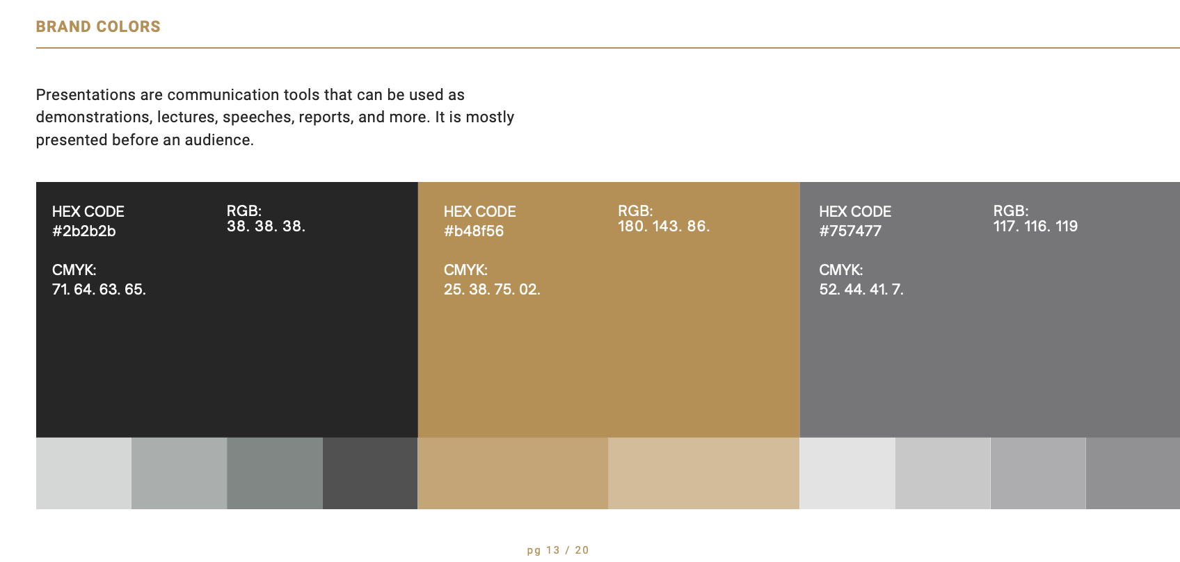
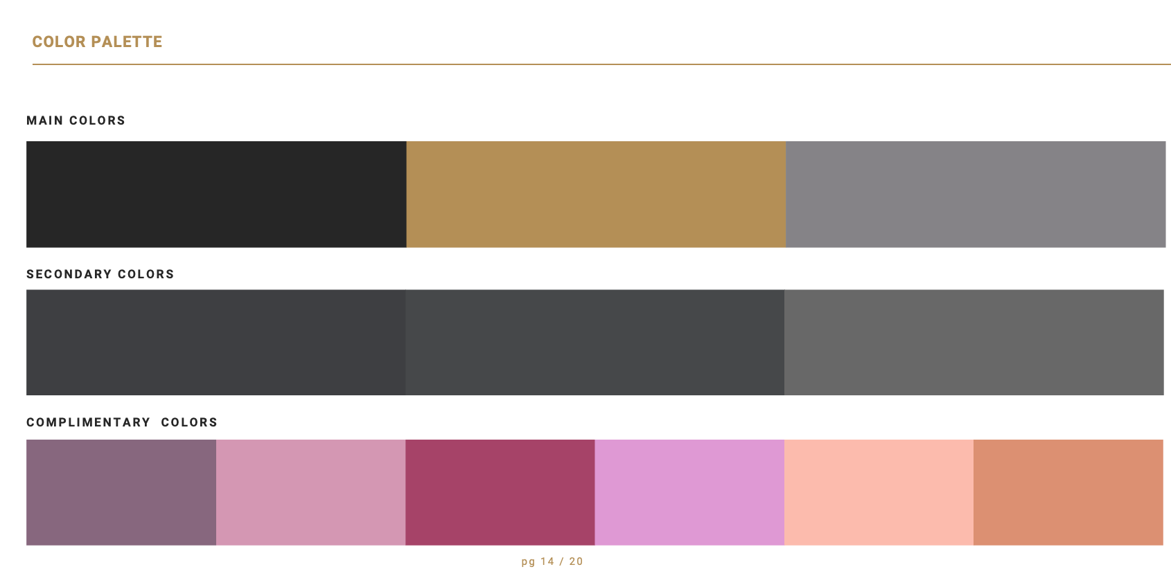
Brand refinement
Refined the visual identity across digital, packaging and campaign touchpoints.
Photography & art direction
Helped shape a warmer, more cohesive image style to support brand consistency.
Brought greater alignment between packaging, e-commerce design and customer-facing assets.
Packaging & digital cohesion

The challenge
While Blossoming Gifts had an established audience, its visual identity lacked the clarity and cohesion needed to create a strong, recognisable brand experience. The challenge was to refine what already existed — improving consistency across digital, packaging and campaign touchpoints while keeping the brand accessible, warm and commercially effective.
My role
As Creative Lead, I:
Led the refinement of the brand across digital, campaign and packaging touchpoints
Developed a more cohesive visual identity system to support consistency across customer-facing assets
Directed and applied art direction across brand imagery and photography
Shaped packaging design updates to better align with the wider brand
Created digital and campaign assets tailored to e-commerce needs and seasonal activity
Worked across both strategic refinement and hands-on execution to strengthen the overall customer experience

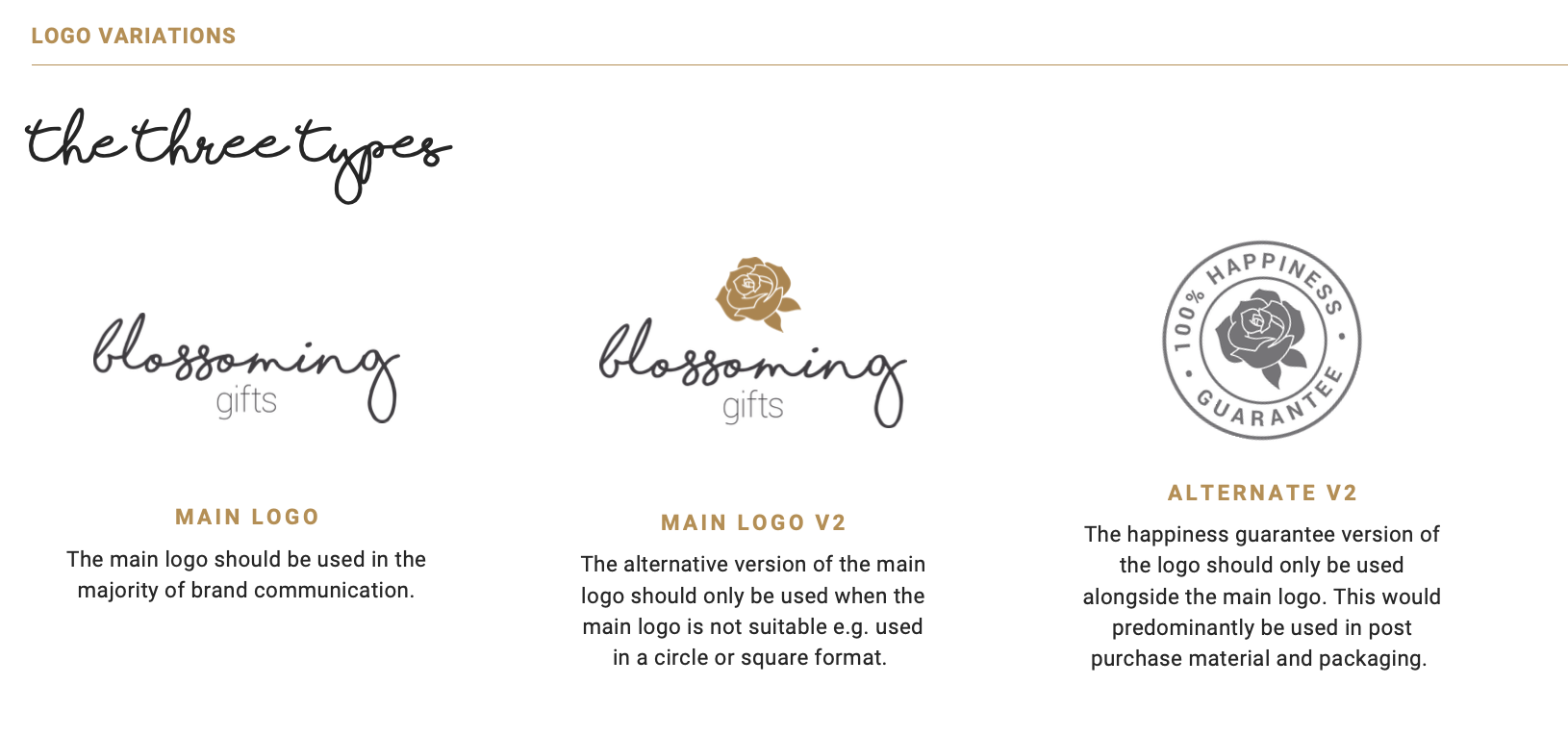
Art direction & photography
Photography played an important role in shaping a more cohesive brand feel. I helped guide the art direction to create imagery that felt warmer, clearer and more aligned with the wider visual identity — supporting both brand expression and day-to-day campaign use across digital channels.


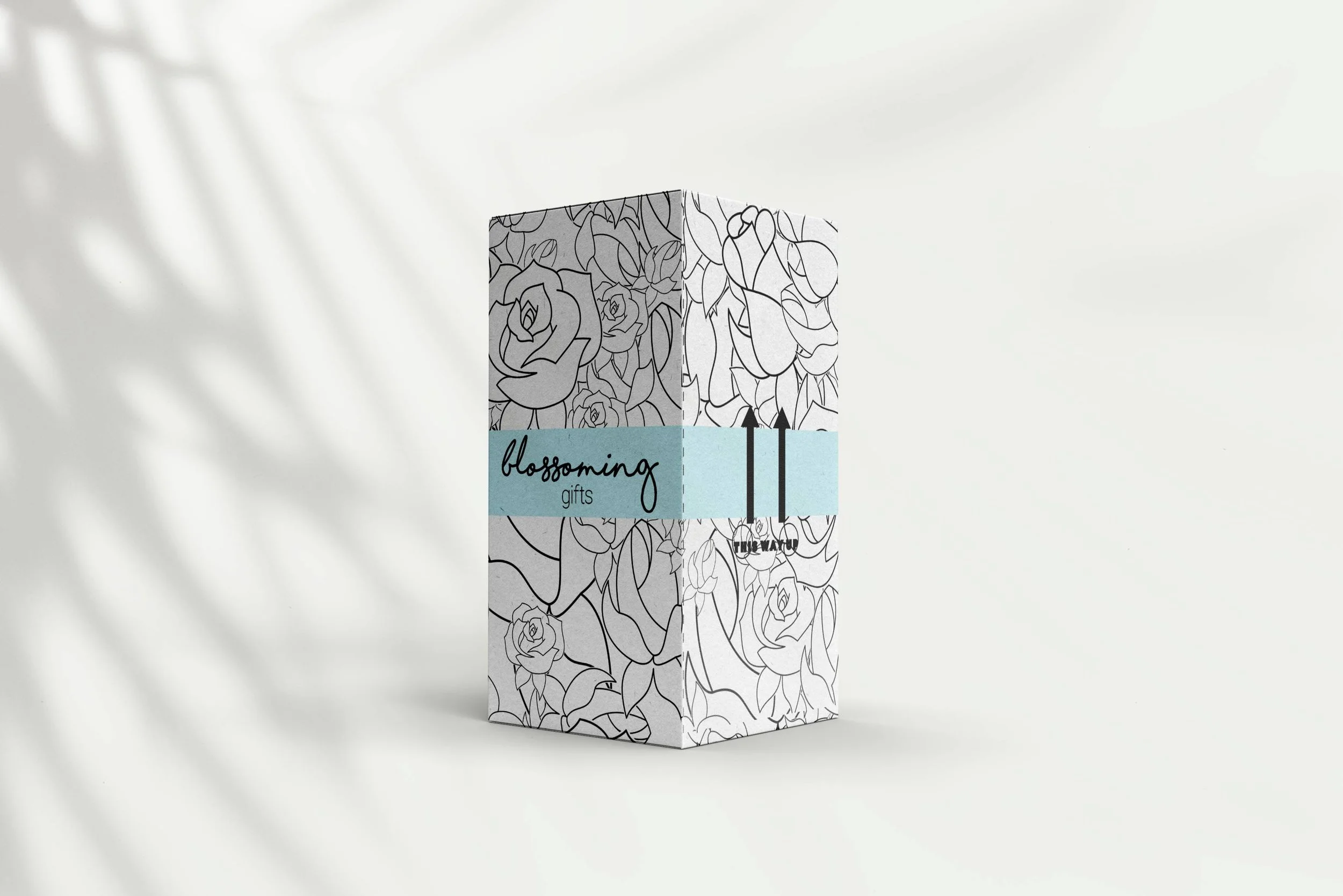
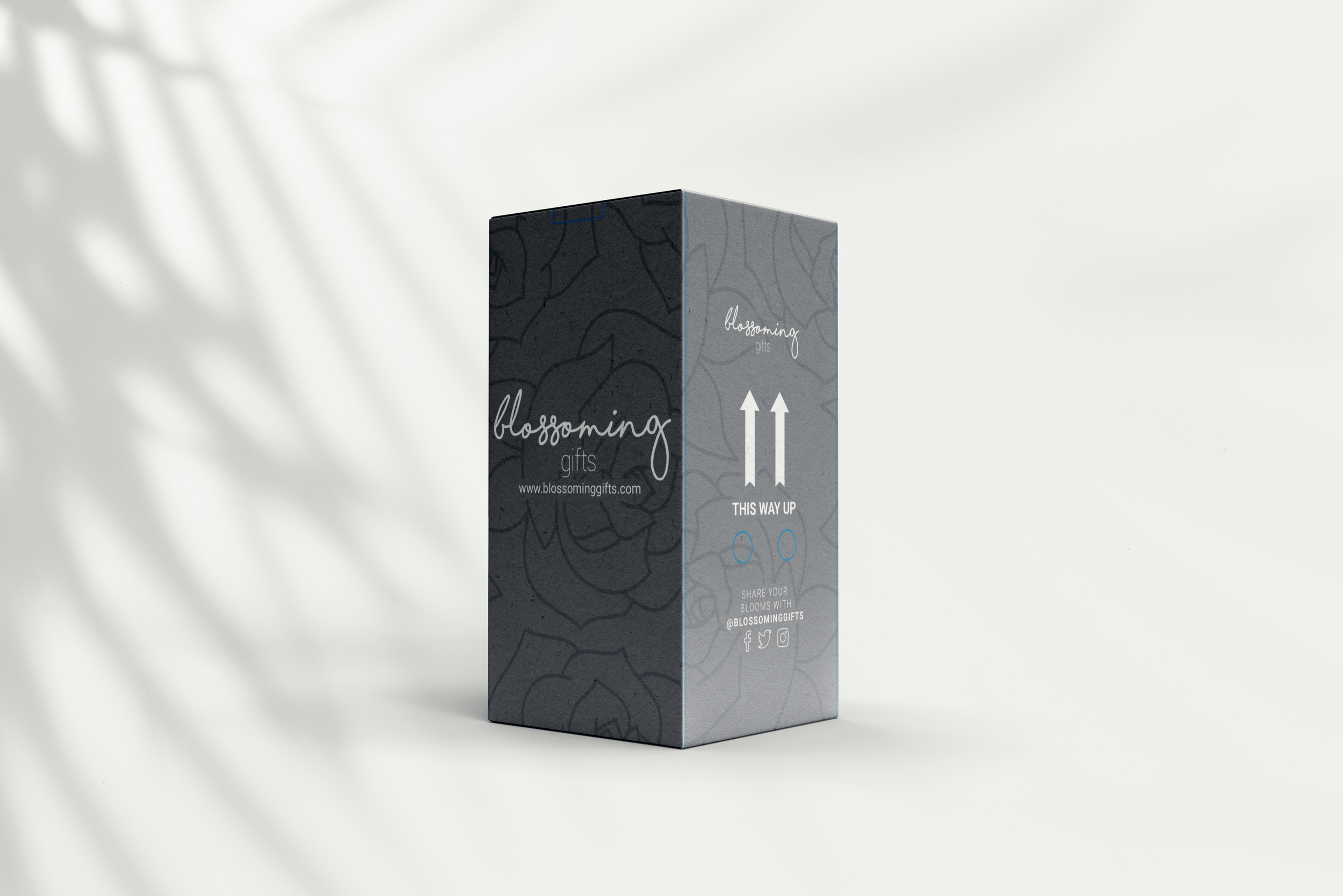
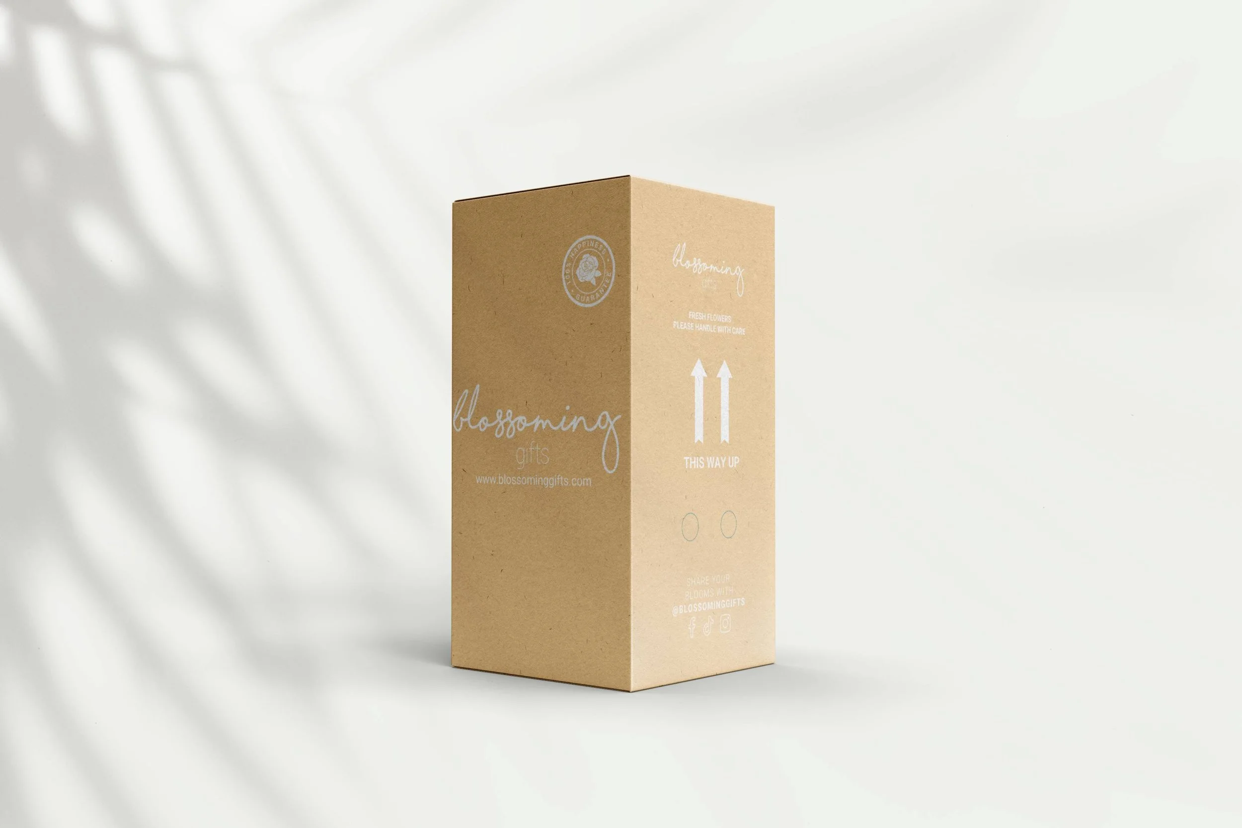
Packaging development
Alongside the digital and brand refinement work, I developed packaging updates that brought greater consistency to the customer experience. The aim was to create packaging that felt more considered and recognisable, while still working practically across production requirements and value-led product formats.
Focus areas:
Refining structural and visual consistency across packaging formats
Improving alignment between packaging and digital brand expression
Creating a more cohesive end-to-end customer experience

Digital & campaign execution
The brand refinement extended into digital and campaign execution, where I created assets for e-commerce, seasonal activity and customer-facing marketing. This helped ensure the visual identity carried through more consistently online — supporting a clearer and more unified brand presence.


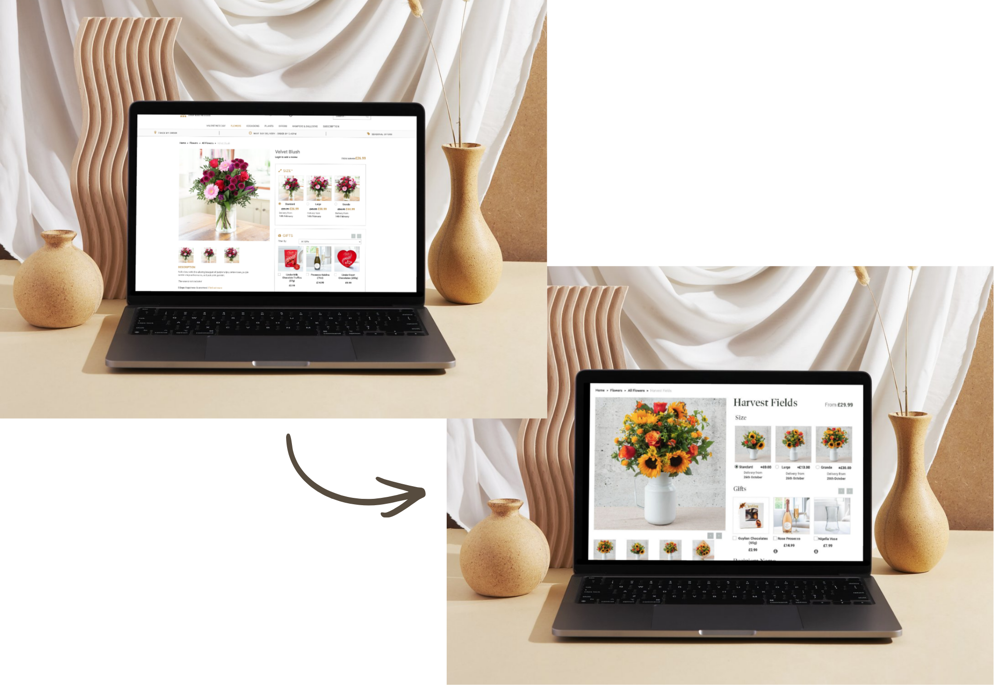
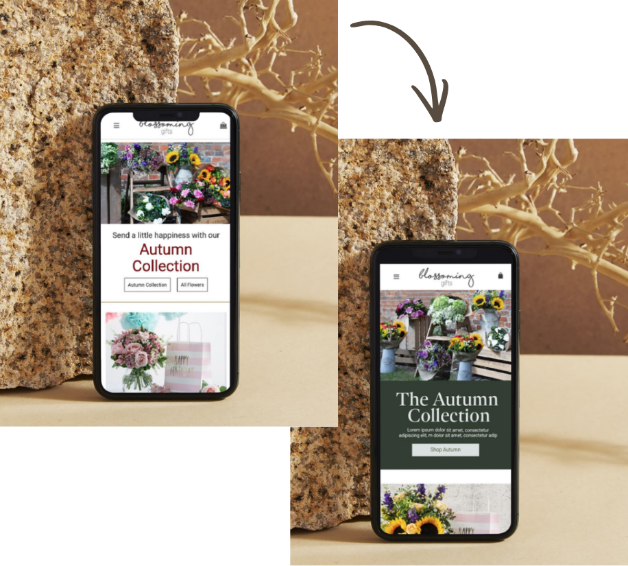
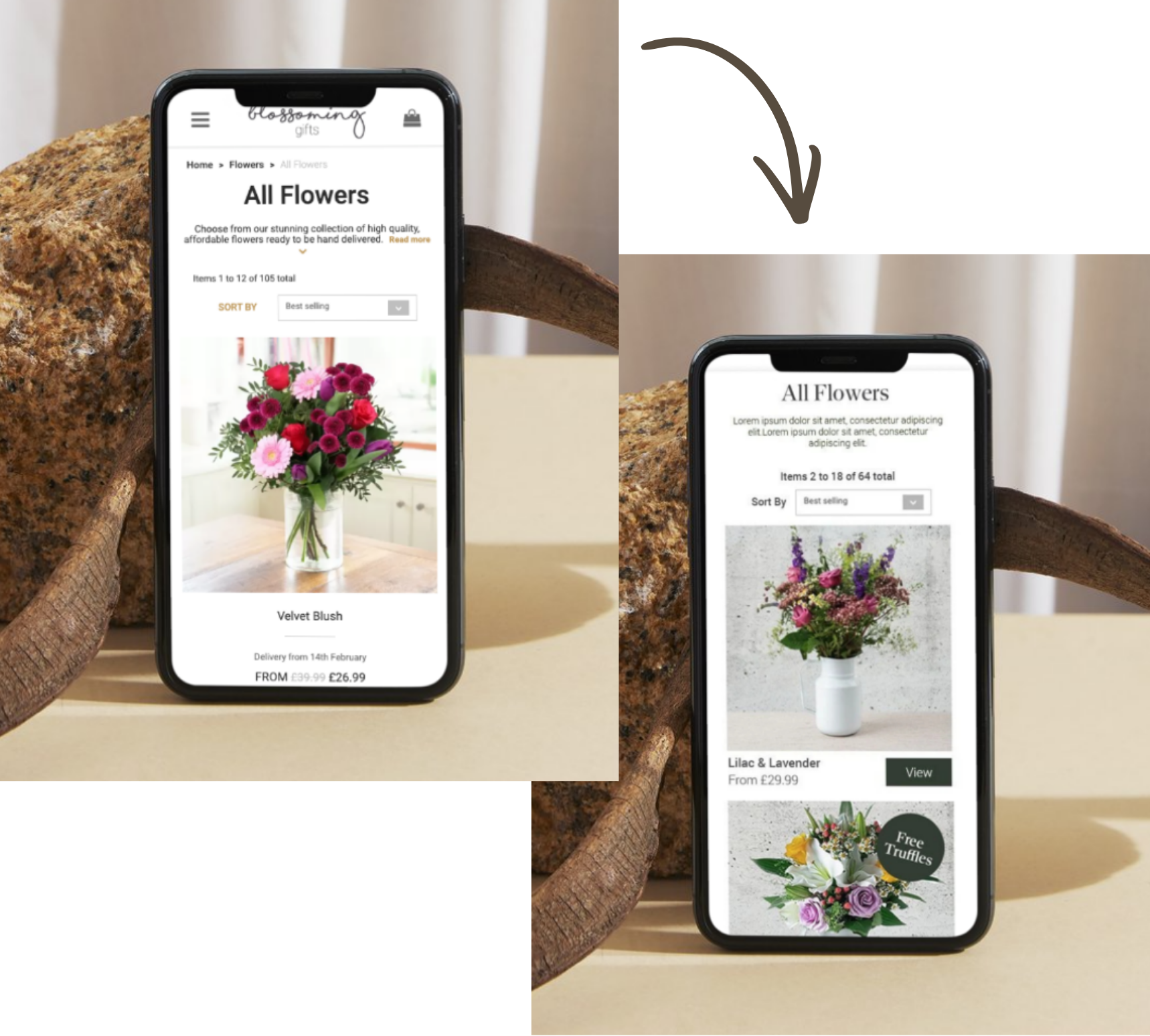
UX & website refinement
As part of the wider brand refinement, I also explored ways the website could evolve to feel clearer, more consistent and easier to navigate.
The focus was on improving structure, hierarchy and product presentation — helping the digital experience better reflect the brand while supporting usability and conversion.
-
![]()
Digital & e-commerce design
-
![]()
Print, packaging & POS
-
![]()
Branding & identity
-
![]()
Appleyard London